
You are using an out of date browser. It may not display this or other websites correctly.
You should upgrade or use an alternative browser.
You should upgrade or use an alternative browser.
CR Facelift - new themes - light and dark versions
- Thread starter jrpark22000
- Start date

jrpark22000
Premium member
Ok, you can chose between the light and dark theme. The change can be made from two places.
.
.
.
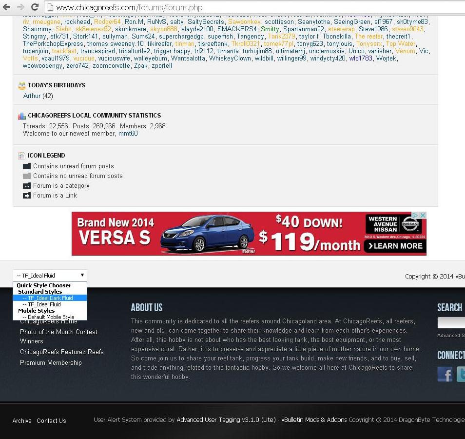
First is at the very bottom of the main Forums page. http://www.chicagoreefs.com/forums/forum.php (scroll to the very bottom)
.
.
(Click Link for larger photo)
http://www.chicagoreefs.com//imagehosting/theme_color_change_forums_page.JPG
.
.
.
View attachment 6475
.
.
.
First is at the very bottom of the main Forums page. http://www.chicagoreefs.com/forums/forum.php (scroll to the very bottom)
.
.
(Click Link for larger photo)
http://www.chicagoreefs.com//imagehosting/theme_color_change_forums_page.JPG
.
.
.
View attachment 6475
Last edited:
jrpark22000
Premium member
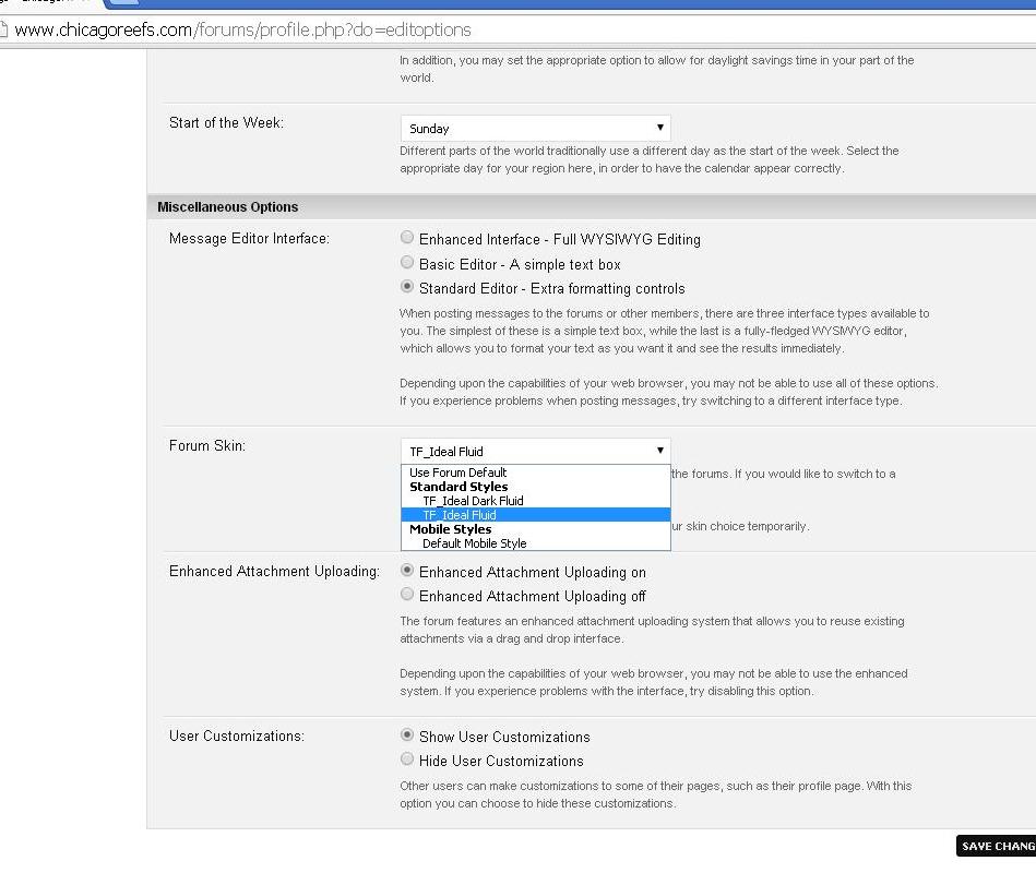
The second is in your user profile page. http://www.chicagoreefs.com/forums/profile.php?do=editoptions (scroll to the very bottom)
.
.
(Click Link for larger photo)
http://www.chicagoreefs.com//imagehosting/theme_color_change_user_options_menu.JPG
.
.
.
View attachment 6477
.
.
(Click Link for larger photo)
http://www.chicagoreefs.com//imagehosting/theme_color_change_user_options_menu.JPG
.
.
.
View attachment 6477

bulldog0407
Premium member
I like the light version as well.
jrpark22000
Premium member
It is defiantly a split decision. Both will stay and I will keep them both updated.
Please keep letting me know which you prefer so I know which to set as the default.
Please keep letting me know which you prefer so I know which to set as the default.
fredfish13
Member
Like the lighter one. On my ipad.
jrpark22000
Premium member
 Everyone happy with the two new themes? Any problems?
 Thank you in advance for your responses.
r33fswagg3r
Premium member
I have just a couple suggestions to throw out there.
The top main tabs would look better in my opinion under the Chicago Reefs logo. If you had the logo take up the top left section by itself it would look cleaner. Our personal profile navigation bar would look better under it and away from the ad box because on a smart phone its close to the ad and sometimes causes you to click on the ad. We don't really need a private messages tab because notifications in our profile tabs notifies us of the same thing.
Not trying to step on toes, just trying to be helpful. Otherwise I like the new darker theme.
jrpark22000
Premium member
I'll conclude the test, the new face will stay. The light theme will be default as I heard no one hating on it, leaving the dark theme as an choice for anyone who likes it.
I don't have any reports of new problems and some of the old login problems are resolved with the new theme. If anyone does have a problem, we'll troubleshoot it, just shoot me a message.
I don't have any reports of new problems and some of the old login problems are resolved with the new theme. If anyone does have a problem, we'll troubleshoot it, just shoot me a message.