You are using an out of date browser. It may not display this or other websites correctly.
You should upgrade or use an alternative browser.
You should upgrade or use an alternative browser.
Please vote for a CR tshirt design
- Thread starter EyeReef
- Start date
The reefer
Active member
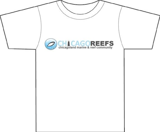
+1 fishbeard. The snail looks nice cuz it's simple and the banner on #5 would go great under the snail
Piscinarii
New member
Honestly, I would love to see 3 and 4 available. 
Pufferpunk
New member
Why pick only one?
Tangency
New member
Why pick only one?
Usually its to keep cost down. The majority of printing costs are in setup fees.
Stonefish13
New member
#4 is by far my favorite.
Piscinarii
New member
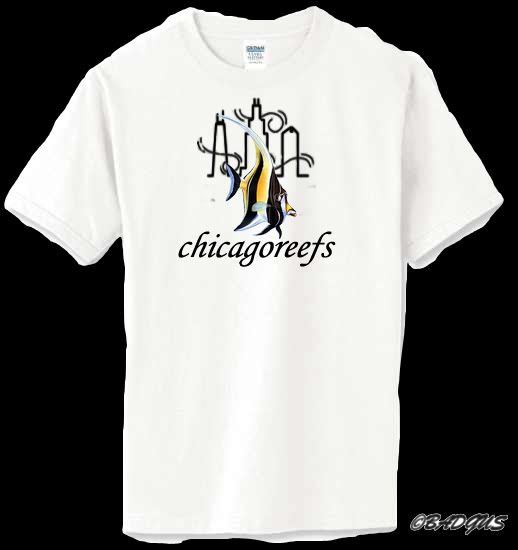
If #4 wins can we at least switch the fish to the Hippo Tang to match the site logo fish? 
Cubzbiggestfan
Member
3
Sent from my T-Mobile G2 using Tapatalk
Sent from my T-Mobile G2 using Tapatalk
BADGUS
Active member
If #4 wins can we at least switch the fish to the Hippo Tang to match the site logo fish?
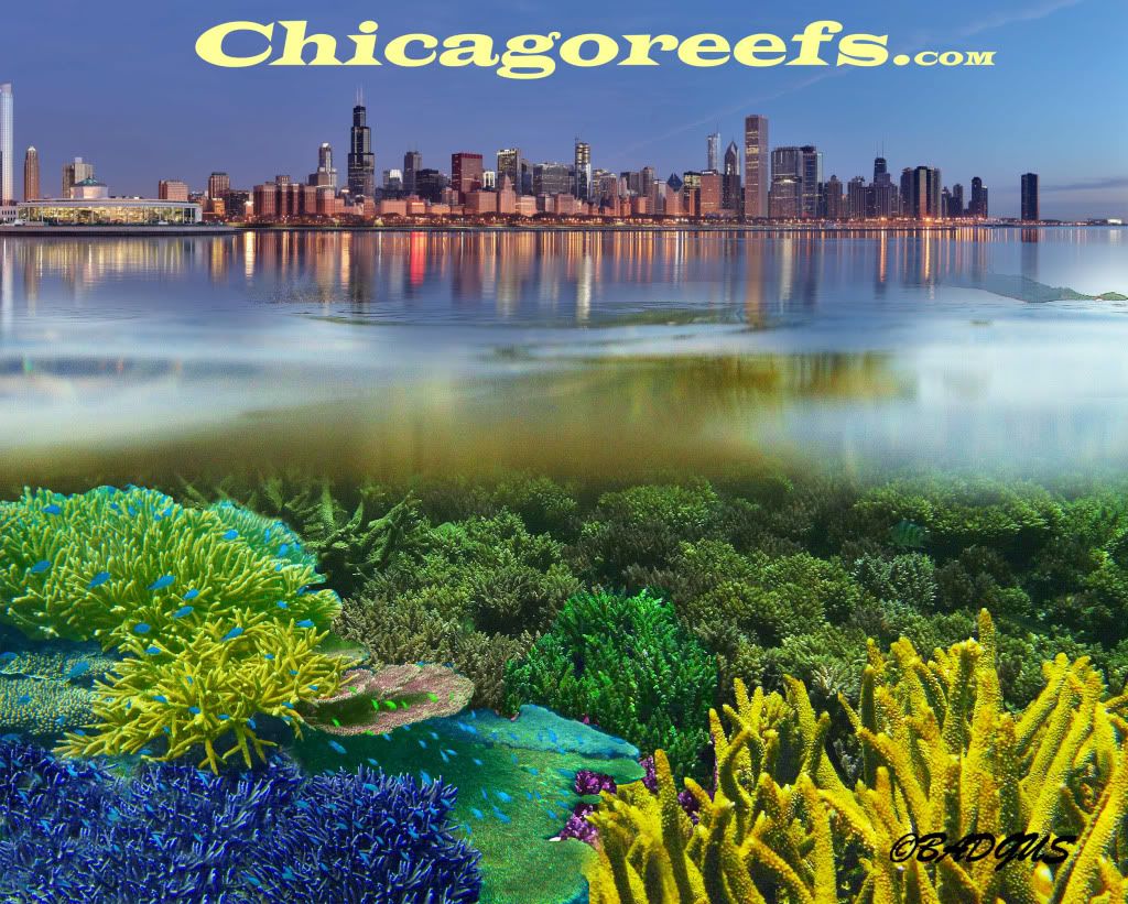
Why not switch the logo to a moorish idol instead?It's a nicer more uncommon fish than a hippo.And keep #1 as the site's banner?


